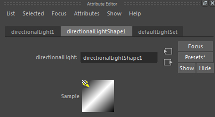
After admiring Maya 2016’s new cleaner look recently, I realised there is a lot of wasted space at the top of the attribute editor. I was thinking it could do with a rethink/ redesign considering its pretty much been like this since version 1. Any thoughts? Am I completely insane?
The proposed layout below. Shift the buttons to the top menu making space for preview icon on the left.

